I’m a new Junior Developer here at ionCube doing a ‘Year in Industry’ for University. I’ve been given a lot of opportunities to tackle interesting problems and implement some really cool things. One such problem we’ve had to tackle is one of those things that you suddenly just notice and get aggravated about over time: the bane of dropdown menus.
“I’ve been given a lot of opportunities to tackle interesting problems and implement some really cool things.”
ionCube24, like many other sites and web applications, has a sidebar on the left. Hovering on certain elements within the menu causes submenus to appear. Simple stuff. It was, however, highly annoying when over or undershooting the submenu by even a pixel as this would cause it to instantly close. Whilst we don’t have any multi-menu dropdowns (which would make this even more annoying to use), it was troublesome enough to warrant implementing a solution to the problem.
I think most problems in the realm of UX or UI design are like this; with enough testing of a product, tiny and seemingly insignificant annoyances in the UI become apparent.
The issue with dropdown menus isn’t an unheard of problem, of course. People try to solve this problem by widening the boundaries of menu items or adding a timeout to their menus. The problem with this is that the former fix won’t help if you accidentally hovered even a pixel within another menu item, and the latter kills responsiveness.
The best solution, in my mind, is what Amazon uses in their main dropdown menu and was implemented by Bruce Tognazzini in 1986 for Apple, as he states himself in a reply to Ben Kamen’s post on the same topic: “Yes, I did invent it back in 1986 and it is firmly in the public domain. From what I remember, it was Jim Batson who worked out the math and coded it for the Mac OS.” [1]
In essence, the solution is very simple, we just create a triangular region between the mouse’s current position on the screen and the upper and lower corners of an open submenu. As long as the mouse is within this triangular region the submenu should stay open. Despite how simple and effective this solution was, it wasn’t adopted into earlier versions of OSX until finally being reimplemented in Mountain Lion.
“I jumped right into it and then realised that it wasn’t that simple.”
I jumped right into it and then realised that it wasn’t that simple. Our base sidebar was implemented entirely in CSS leveraging :hover on lists, and thus we couldn’t just keep the submenu open as the submenu would only stay opened if its parent element was being hovered.
We probably could have rewritten the menu system in JavaScript but it works the way it is. It loads quickly and we shouldn’t fix something – and make it more complex – for no real reason. I ended up leveraging some simple DOM Modification alongside the plain JavaScript solution to the problem to keep the submenus open.
Essentially, since our CSS looks like this:
.sidebar > .menu > .submenu { display: none; }
.sidebar > .menu:hover > .submenu { display: block; }
We can take advantage of the fact that hovering over a subelement of the menu maintains a :hover state on that menu element. I use some JavaScript to spawn a ‘mask’ which covers up other menu’s which lie between where our triangle would be, and this not only keeps the submenu open (since this mask is now a child of the hovered menu) but it also intercepts hover events from reaching other menu items.
There are probably more complex ways of intercepting hover events from reaching other menu items, and keeping the submenu open but it’s much easier to just spawn the mask as a rectangle of the correct height. This is completely trivial.
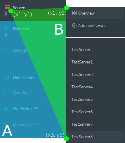
We simply spawn a mask (A) at the bottom of the current hovered menu item, and set its height to the same as the height of the submenu which is just the distance between y2 and y3 (of B).
Now, that we have perfect masks for our submenu to maximise responsiveness, we check the position of the mouse against the triangle (B) we created every 25ms or so, which doubles as a ‘debounce timer’.
Once the mouse leaves the triangle (B) and the next tick of our check runs, we destroy the mask (A) and voila, the menu closes and the next menu opens. Once the next menu opens, we just create another triangle and that’s that.
Triangle ‘creation’ also only stores the three points in the diagram above, so this is practically costless. Checking the mouse’s current position within the triangle is also fairly simple and there are many methods for doing so. We went with a fast approximative method with Barycentric Coordinates [2]
With some additional testing, we decided that there were two minor issues with the menu:
- Since the mask covers up everything underneath it and doesn’t despawn until you leave the triangular region, you can’t click the menu items it covers up, which makes intuitive sense until you realise that a user might have been trying to hit the next menu down but still moved within the triangular region. This was a simple fix with a timer which we set to 125ms, and it checks that the mouse has moved towards the submenu. If it stops moving or moves the wrong direction for 125ms or longer, then we destroy the submenu. This does reduce the responsiveness just a little bit, but in practice it works fine and isn’t noticeable.
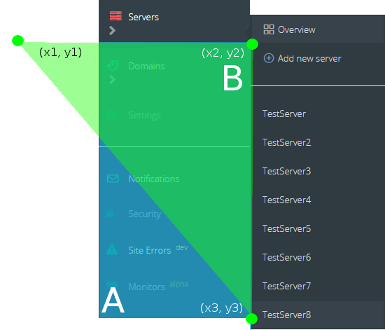
- Testing with various devices, we noticed that side-trackball users tended to move in a curved fashion unlike the generally straight movements we make with mice (though trackballs with the ball in the middle tend to also move in straight lines). There are several solutions to the issue such as checking against some kind of arc or rounded rectangle rather than a triangle. This wasn’t the approach we went with because the triangle was chosen initially because we would only have to store 3 coordinates and use a simple collision checking function. We tested that we could accommodate a similar result as the arc solution by simply skewing the triangle a little. We ended up stretching the triangle by ¼ the submenu’s height to the left and everything seems to work well without loss of responsiveness. See the diagram below:
Overall, the triangular regions work really well. It’s amazing how such a small and relatively simple change positively affects the UX of our sidebar. Since I’ve implemented this, we’ve further improved it and optimised it by not repeating unnecessary work (for example, originally we were creating a new triangle and mask every 25ms even if the mouse hadn’t moved). Even without these optimisations though, its performance cost was negligible and we didn’t even optimise it for performance issues but to get rid of rapid DOM flickering which made Chrome’s Devtools annoying to use.
What’s next? We’ve toyed about trying to predict and auto-highlight submenu choices based on the trajectory of the cursor which would be rather neat. Given that we store a cache of the cursor’s current position, working out the trajectory shouldn’t be much more difficult. Whether or not this ends up being unintuitive or impractical to use, I don’t know, but given how potentially easy it would be to implement we might as well give it a go and see if it makes our UI any nicer to use 🙂
- Chris is a student at the University of Kent, and has taken on the role of Junior Software Developer at ionCube for his third year’s placement/internship option.
- ionCube24 gives you real-time intrusion protection on your website by actively preventing unexpected PHP code from running on your server, plus features such as reporting of PHP errors and server monitoring. Immediate email alerts let you know when there may be a problem.


